Pixels To Print: Don't Make the Logo Bigger
- NorthPoint

- Mar 24, 2021
- 2 min read
The bigger the better is the rule to go by, right? Well…not necessarily. Many brands have the belief that their logo size and placement needs to be bigger to be more noticeable and memorable. However, if you take a closer look, some of the most famous brands actually have their logo very small almost everywhere.
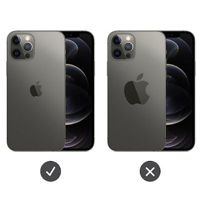
Let’s think about Apple, for example. Apple is one of the biggest and most well-known brands in the world, and how is their logo usually shown? Small, and often as black, white, or tone-on-tone. They keep their branding subtle because they know that the value of their brand is much more important than the size of their logo on a product. This strategy and way of thinking can not only be applied to any brand’s marketing, but also has additional benefits as well.
In most cases, when we are buying products or services, we don’t buy them because of a logo. We buy them because we know that their company and product/service offered is one that we value and trust. When it comes to branding and marketing, emotions play an absolutely essential role, which is why it is more important to focus on the emotions that your brand evokes rather than the size of your logo. Yes, having a well-designed logo is equally as important, but it is about using your logo in the best way possible. Once your have emotions that can be associated with your brand, your logo can then be used as the visual recognition of these emotions.
When we think of Nike, we think of a brand that represents not only quality athletic products, but also one that encompasses authenticity, inclusivity, innovation, teamwork, determination, and courage. Why? Because they have built their brand up to be focused around these things. They have spent years advertising what they support and what they encourage so that their brand is naturally associated with these values. Their logomark: a simple swoosh mark. And it is more often than not that they use this symbol over their full “Nike” logo, whether it is on their website or the products themselves, which goes to show that their efforts are placed more so onto the value of their message and products versus making their logo visible.


Having a logo that is placed too largely can have additional psychological effects on a customer as well. When we see a giant logo before anything else, it can create the feeling that brand is more important than the customer, which is the opposite of what every client wants to feel. Too large of a logo can also often times be more distracting than beneficial. Customers and clients are interested in what your company, product, or service offers and the information that provides them with the benefits, so if your logo is too large and overwhelming, they may be drawn away from what you actually want them to see.
Next time you are placing your logo online or on a product, think about what it is that you are truly trying to convey and how your logo should be scaled to a size that complements your brand and it’s message! Bigger is NOT always better!


Comments