Pixels to Print: Illusions in Design
- NorthPoint

- Jan 16, 2020
- 3 min read

In some rare yet fascinating occurrences, when strategic design is combined with a confused and deceived perceptual system, something called an illusion is born.
Many of you may be thinking of the most famous goblet illusion, where in one second your brain processes the silhouette of a white goblet on a black background, but when looking back in the next second you instead see two black silhouetted faces facing each other on a white background . This is just the tip of the iceberg in terms of what our brains can perceive. Why does this happen, though? Before I go into an in-depth blog post on the functionality of the brain when perceiving illusions, I’ll instead give you a quick recap, along with some of the most common examples of illusions in design that we come across more often than we think.
Illusions in the simplest of forms are when what we actually see with our own eyes clashes with what our brain is making us think we’re seeing. Our brain is perceiving an image in a way that differs from objective reality in an attempt to make sense of the world around us. Essentially, our brains are constantly tricking us into seeing things that are not really there. Crazy, right?!
Here are just a few examples of illusions that can occur in the world of design:
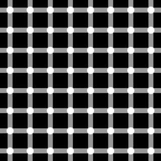
1) Hermann Grid Illusion

What color do you see at the intersecting dots – white or black? Or both? While the dots are actually all white, our brain perceives them as black when we look at them with our peripheral vision because of something called lateral inhibition, which is a result of the differing amount of light falling on the smaller and larger receptive fields of the background and dots.

Keep in mind the Hermann Grid illusion when designing a grid for your website or collateral!
2) Jastrow Illusion

Which shape is longer, number 1 or 2?
Trick question!! They are indeed the SAME size! Don’t
believe me? Measure it out yourself, and you will see that when placed on top
of each other, these two shapes are identical. This illusion typically occurs with curved objects, such as these two,
that are aligned vertically, leading to the illusion of the bottom shape
appearing longer!
3) Muller-Lyer Illusion

If you have noticed this illusion before, you are one of very few. When crafting a font, typographers almost always rely more heavily on what looks good rather logical thinking when it comes to character sizes. When each character is created to the same height, the overall word will look disproportionate, as you can see in these two commonly known logos above. Instead, typographers and designers use the process of “overshooting” to resize individual characters to achieve a balance in type that is the most visually pleasing. Chances are you haven’t noticed the difference in size of the characters, though, as your brain has successfully tricked you into thinking that they looked the same!
4) Illusion of Motion


Stare at these images for long enough and the shapes will start moving! Why does this happen? The operating principle here is called apparent motion. It happens because there's so much geometric repetition and other data impacting varying portions of our retina all at once that our brain is fooled into believing there is movement!
Illusory movement is a great way to engage your audience in both a physical and mental way, grabbing their attention in no time!
5) Simultaneous Contrast Illusion

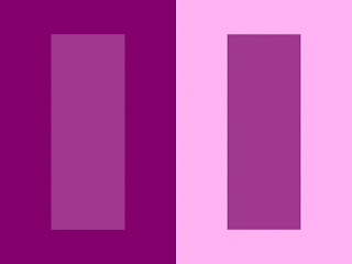
At first glance, the inner rectangle on the right looks like it is a darker shade of purple than that on the left, right? However, if you move them next to each other, you will see that they are actually the same color! Placing two objects of the same color on different contrasted backgrounds can make both objects appear as if they are in fact different colors.
This illusion is seen even more dramatically with text, as you can see in the example below, using our brand’s logo!

The logo color is the same in both, even if the left might appear lighter to the naked eye.
After learning more about illusions in design and how they can affect our perception, you may start to become more aware of what effects these types of instances have on your brain. Perhaps you might even try implementing a hidden illusion into your own work to engage your audience in a new and intriguing way!


Comments