Pixels to Print: Logo Swap
- NorthPoint

- Sep 5, 2019
- 1 min read

Branding is essentially the face of the company. It’s meant to be recognizable and give an intro to who the company or product is. After some time these brands become integrated into pop culture hoping to become familiar to you! After a while, you don’t even need to read these fond logos anymore, and you can instantly recognize them by their color and shapes.
Now that some these popular brands are fused into your subconscious, look at these competitor logo swaps to see how uncomfortable they make you feel! Do any look like an improvement to you? Does it change how you would perceive that brand compared to their real branding? Or are they just logo no-no’s?
McDonalds vs. Burger King

Starbucks vs. Tim Hortons

(image credit: www.cda.edu)
Pepsi vs. Coca-Cola

(image credit: www.cda.edu)
Chick-fil-A vs. KFC

(image credit: www.cda.edu)
Domino's vs. Pizza Hut

(image credit: www.cda.edu)
Krispy Kreme vs. Dunkin' Donuts

(image credit: www.cda.edu)
Baskin Robbins vs. Dairy Queen

(image credit: www.cda.edu)
Cadbury vs. Hershey's

(image credit: www.cda.edu)
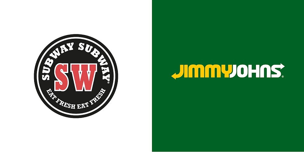
Subway vs. Jimmy Johns

(image credit: www.cda.edu)
Campbell's vs. Progresso

Need help with branding? Utilize NorthPoint’s Design Services with anything you need!


Comments